Lifeline
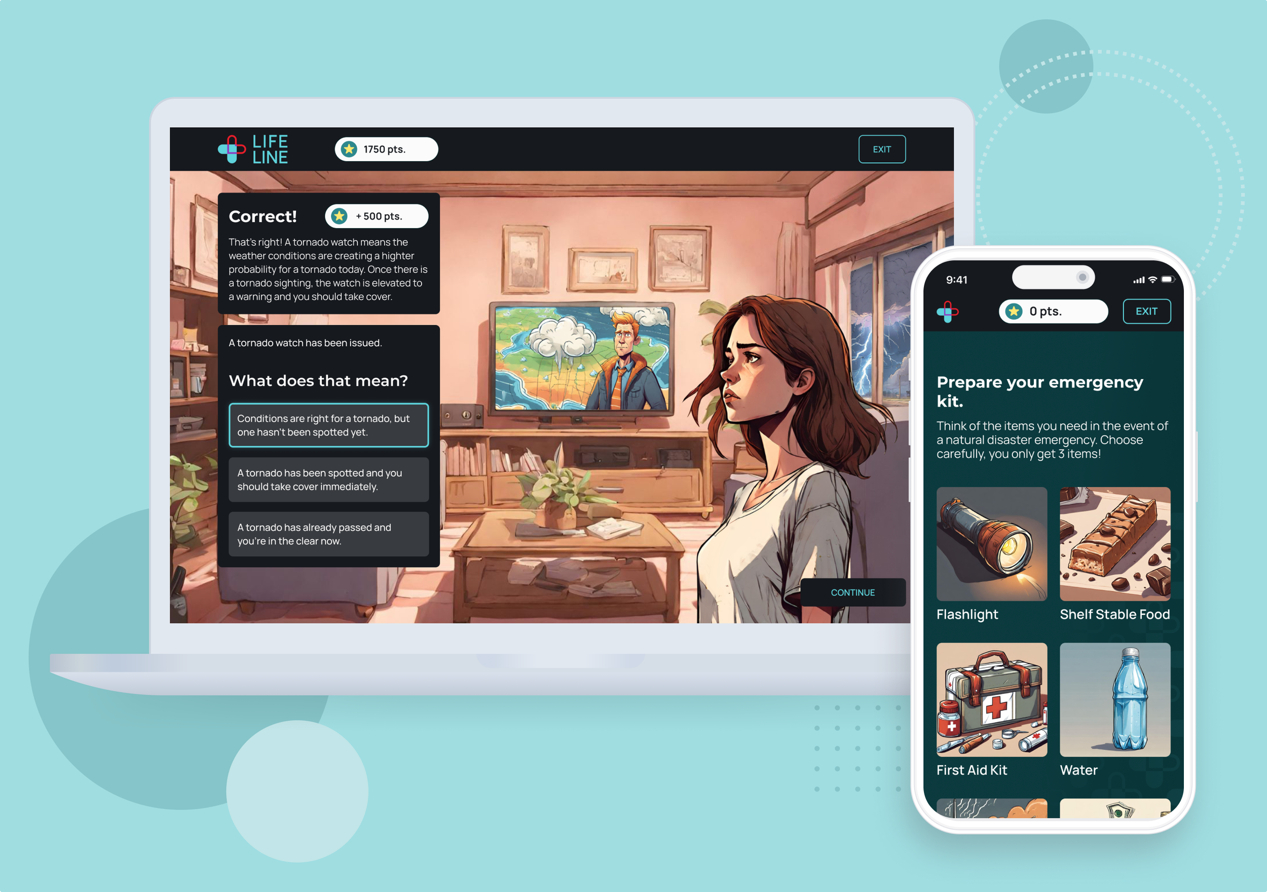
Gamifying disaster safety. A web app to educate users about best safety practices during natural disasters.
Team
Product Designer - Sarah Payne
Product Manager - Schadre Dent
Backend Developer - Ann Onyeka
Frontend Developer - Victor Adeoye
THE PROBLEM
Unaware and Underprepared
Natural disasters such as tornadoes, hurricanes, and wildfires are increasingly frequent and devastating events that affect millions of people across the country. Despite these risks, 60% of Americans remain unprepared and unaware of how to properly respond to these catastrophes. This knowledge gap can result in loss of life, severe injuries, and massive property damage.
THE CHALLENGE
How might we transform learning about
natural disaster preparedness into an interactive experience that empowers individuals with life-saving knowledge?
THE SOLUTION
Gamifying Disaster Safety
To help better prepare individuals living in disaster-prone areas we created an immersive storytelling game experience to educate users on best preparedness and safety practices during natural disasters.
THE SOLUTION
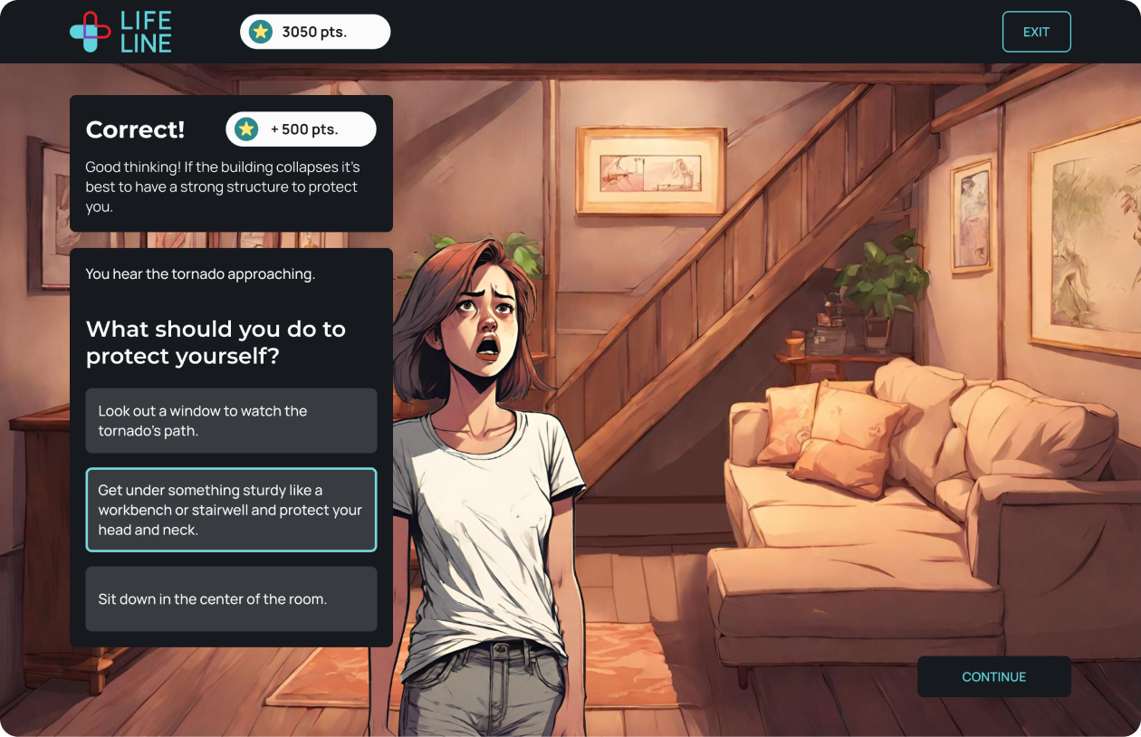
Tornado Safety Game
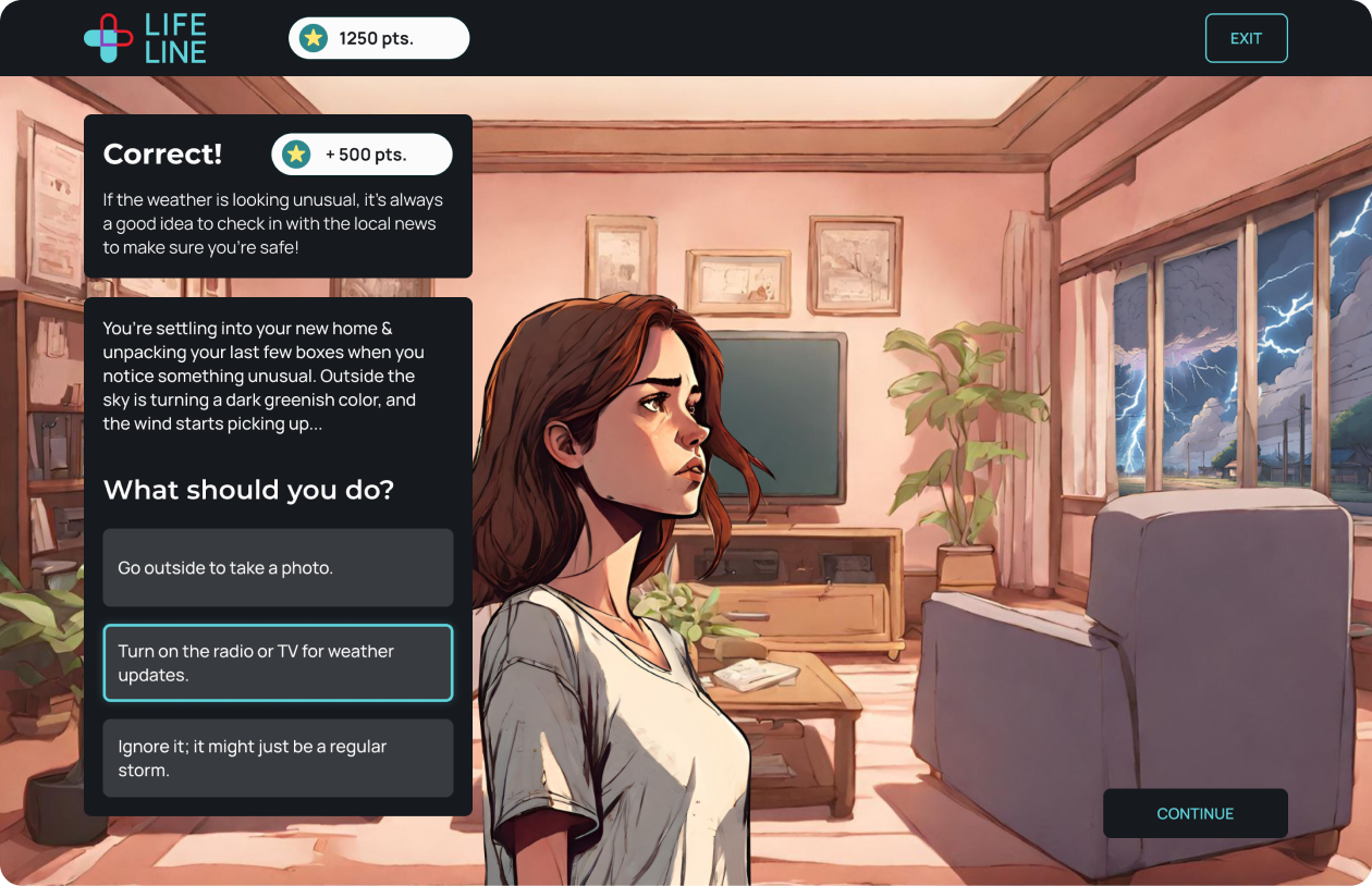
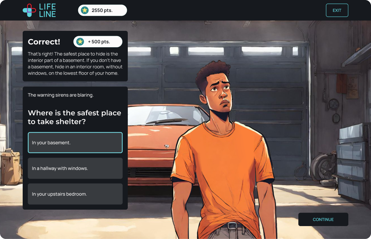
Users can further retain the life saving disaster safety knowledge through action and experience. Forget about flipping through a boring brochure or skimming a news article. Lifeline enables users to enter the eye of the storm and experience the effects of their choices.
THE SOLUTION
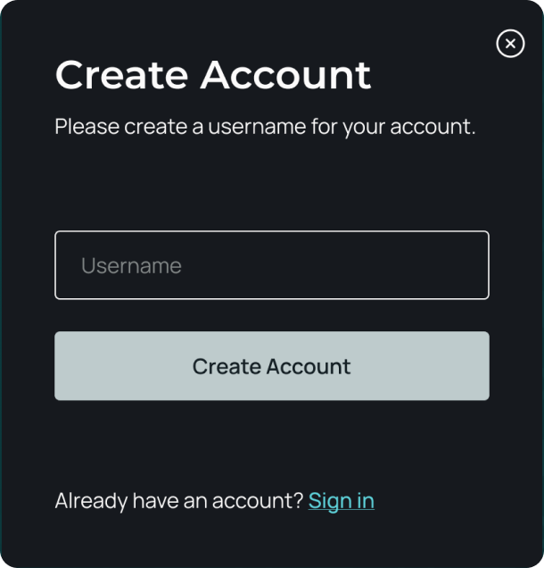
Account Creation
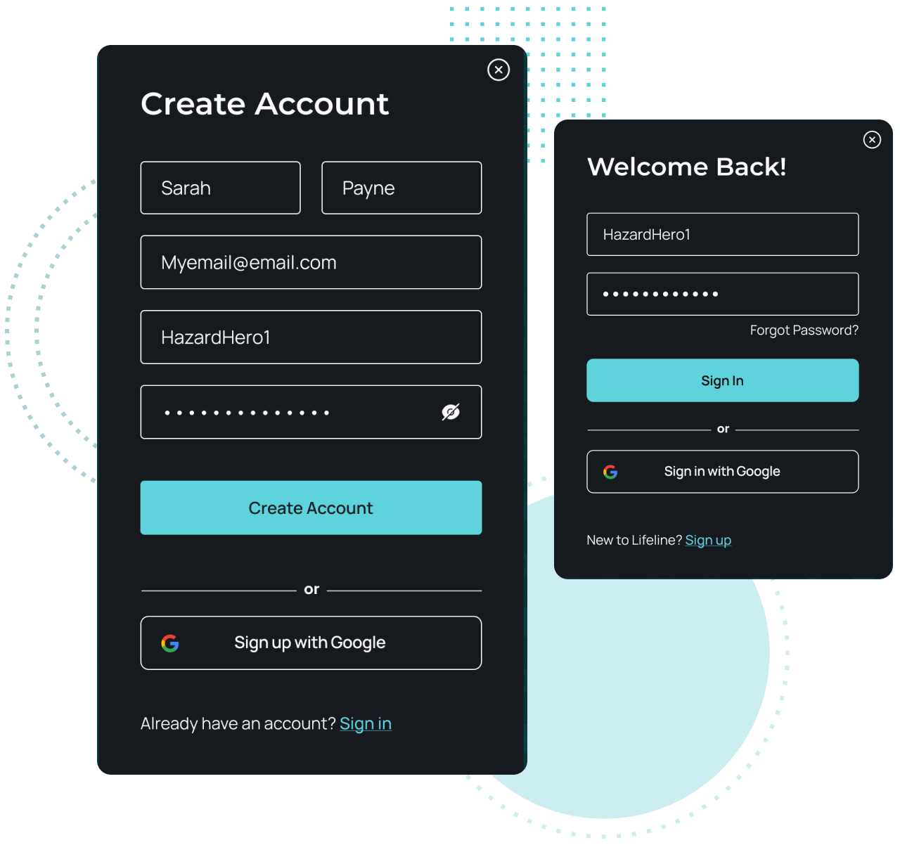
We provided users the option to create an account to save their progress throughout the game and recieved their contact to notify them with new game updates and releases.
THE SOLUTION
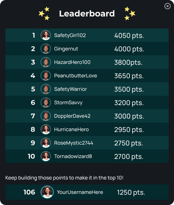
Leaderboard
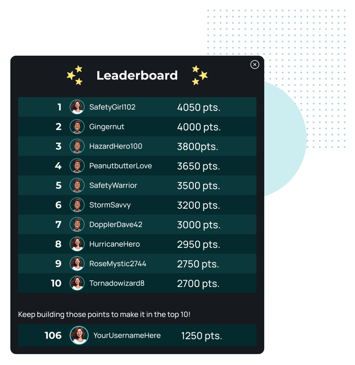
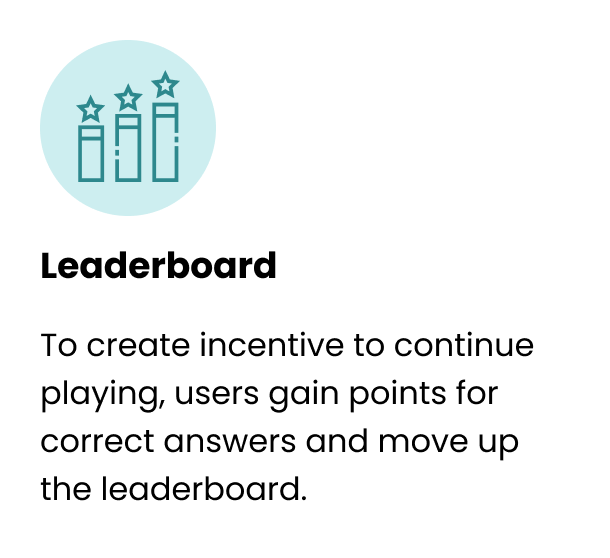
Learning is always more enjoyable with support and encouragement. With the Leaderboard users can play against friends and create friendly competition to see who is best informed on how to act in a natural disaster.
USER RESEARCH
Discovering users disaster
preparedness & knowledge
4 Adults living in tornado-prone areas
Learn about experiences of living in tornado-prone areas.
Discover how people have been educated on dangers and safety measures to take during a tornado.
Determine how people prepare for natural disasters now.
Learn what unexpected difficulties natural disasters can bring.
Interview Goals:
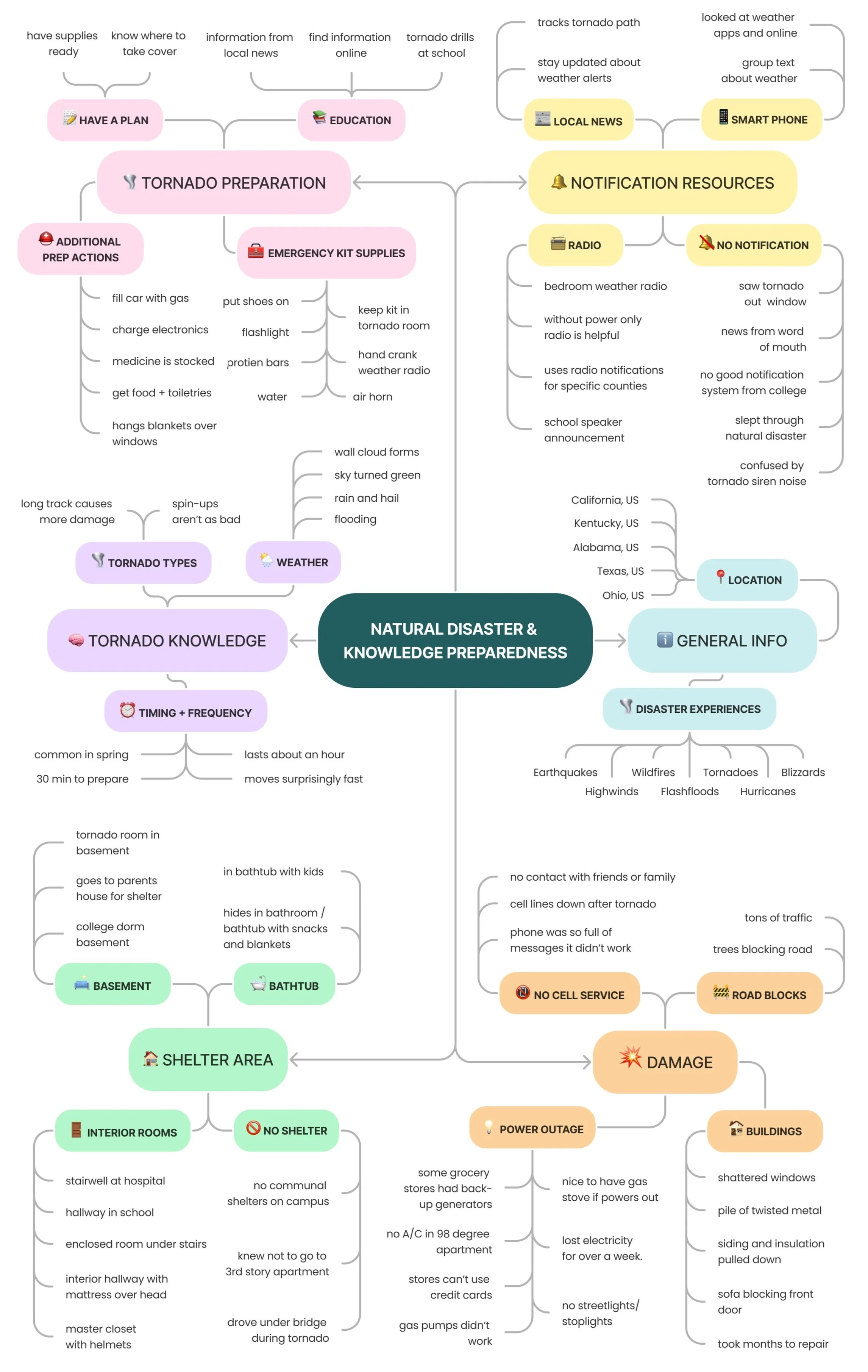
INTERVIEW MIND MAP

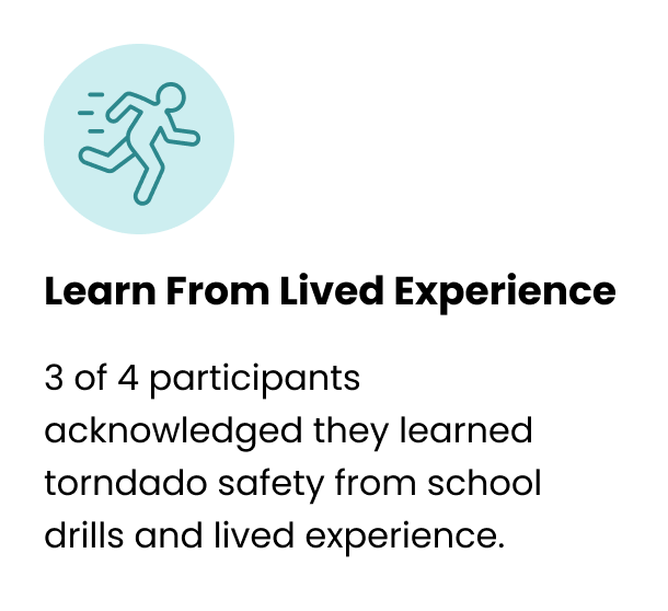
Interview Takeaways
ADDITIONAL RESEARCH
Studies from American Red Cross and Allstate found that around 60% of Americans aren’t prepared for a natural disaster event.

FEATURE PRIORITIZATION
Immersive Learning
Keeping technical constraints in mind, our team ideated on several features to create most interactive learning experience and we narrowed down to these 3 key features for our MVP:
SITEMAP
Structuring the Site
With only five weeks to launch our product, the sitemap had to stay fairly simple. We also had to account for future growth of our product like the addition of different themed games.
USER FLOW
Basic Gameplay
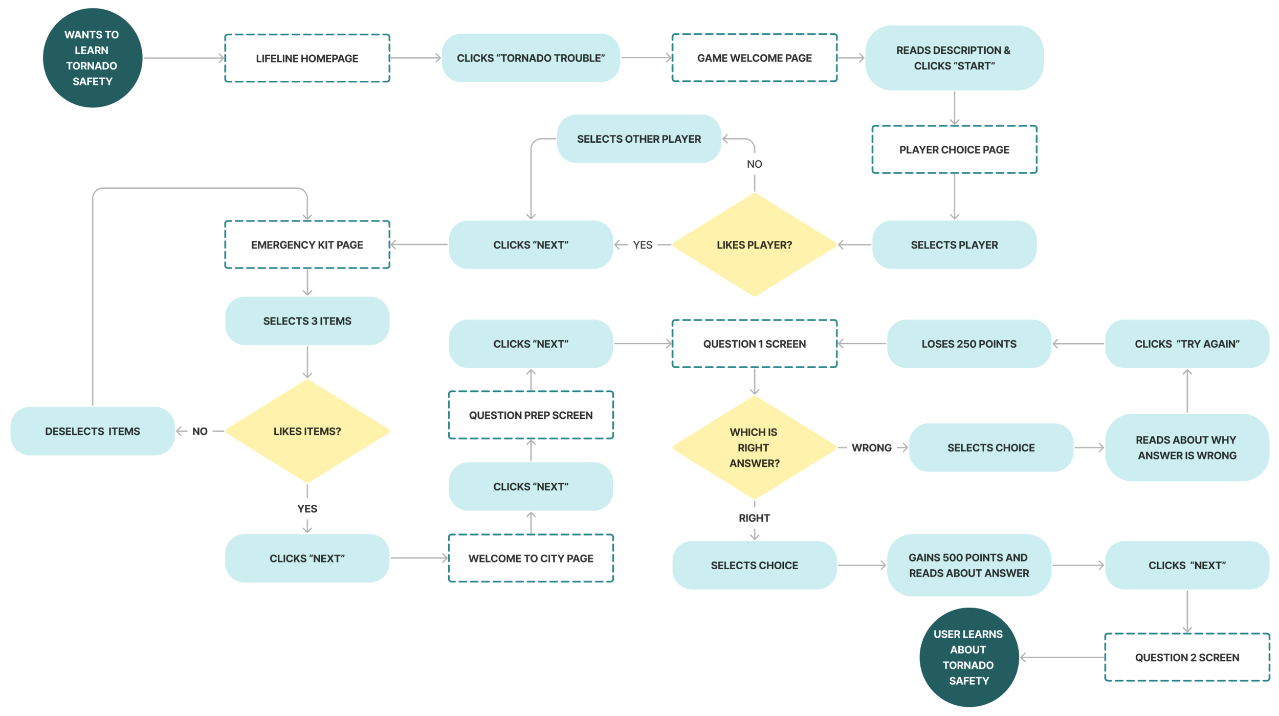
The biggest component of our MVP was the actual gameplay. Working out the operation of the game was essential for our team to start building the product.
User Story: As a user, I want to learn what precautions and reactions are right and wrong during tornado scenarios so that I can protect myself in a real tornado event and avoid making life-threatening mistakes.
LO-FI TO MID-FI WIREFRAMES
Sketching Out the Flows
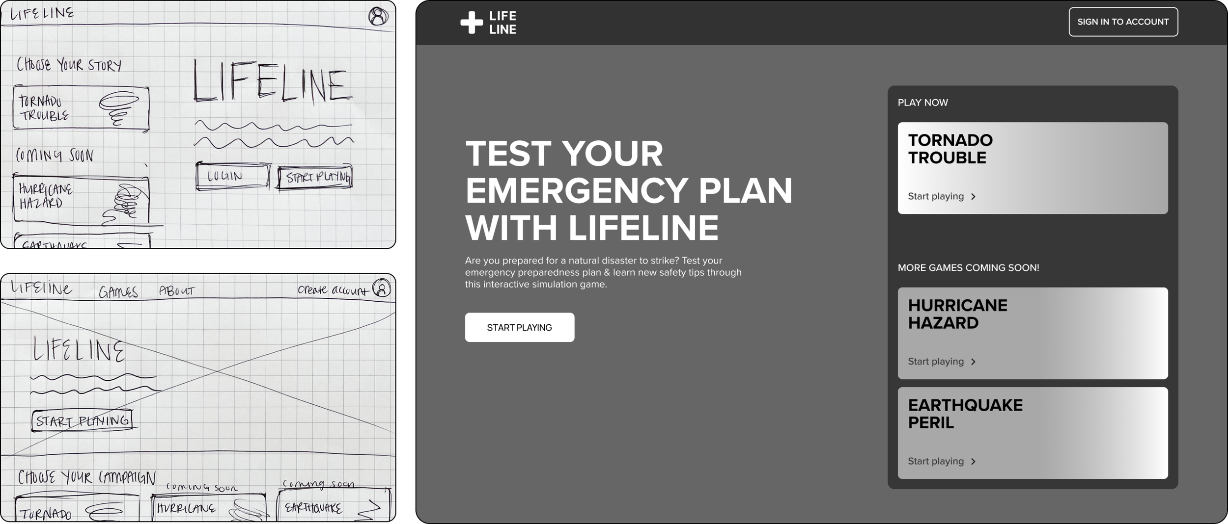
I began designing the interface with hand sketches and refined the design in Figma, getting user and colleague feedback along the way.
HOMEPAGE
We wanted to show future game releases to let users to know there is more on the way and for investors/partners to see the potential growth for the product.
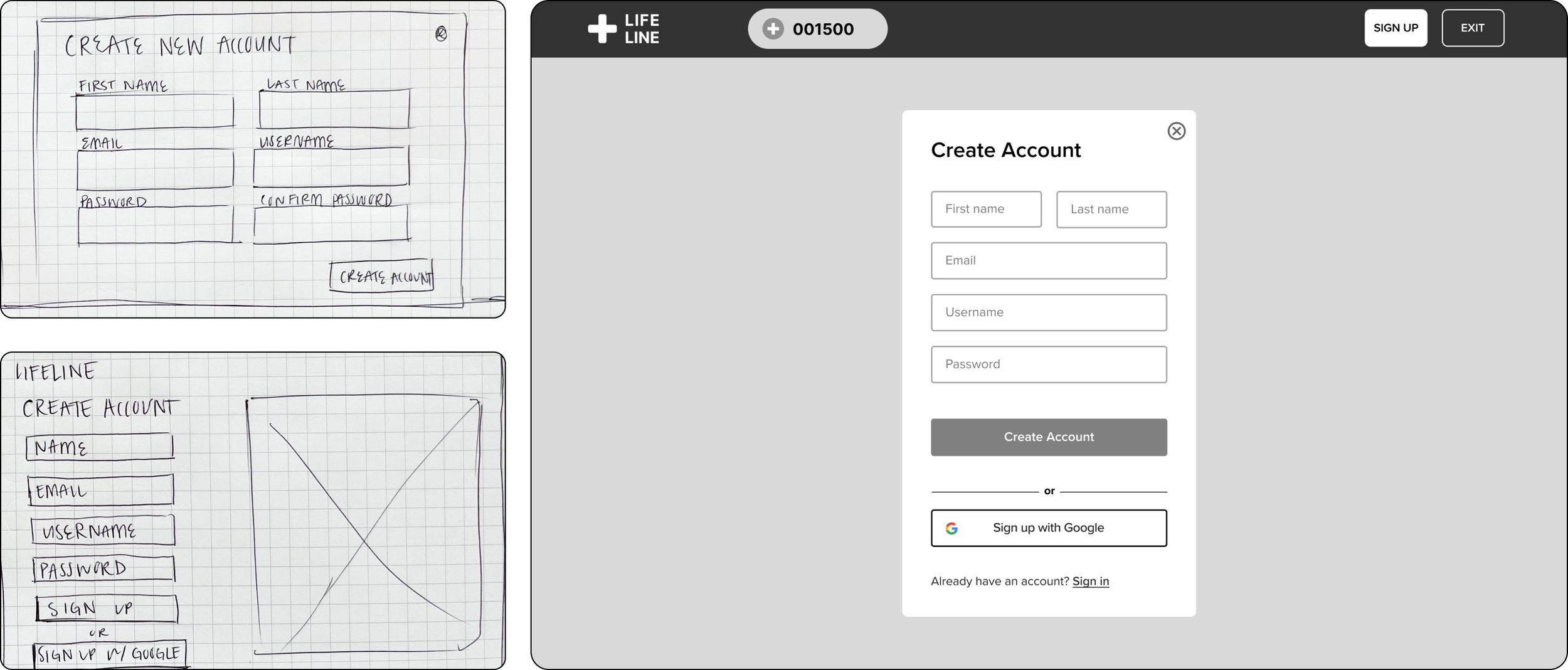
CREATE ACCOUNT
The account creation flow initiated a lot of conversation around what information to collect from users and if our team could connect with google sign up for user ease.
GAME START
MAIN GAMEPLAY
EXIT MESSAGE
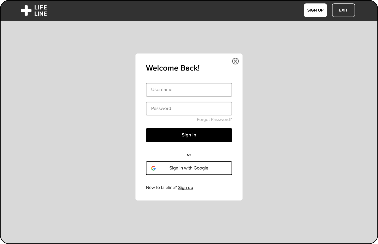
SIGN IN

HI-FI WIREFRAMES
Lifeline: Turning the Tides of Disaster Preparedness
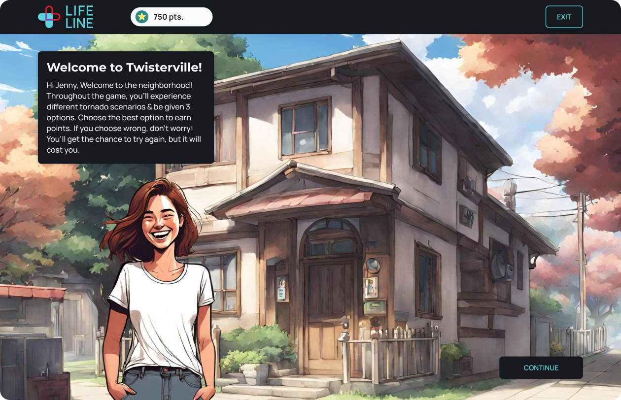
The storyline nature of the game required unique illustrations to engage the audience, but with the tight turn around there wasn’t time to draw out each scene. I utilized AI to create most of the drawings and edited the smaller details in Photoshop.
HOMEPAGE
HOMEPAGE LOGGED IN
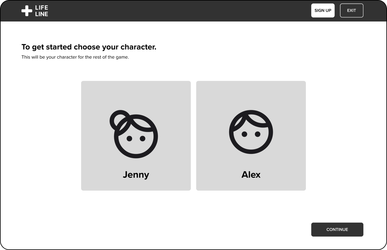
GAME START
CHARACTER CHOICE
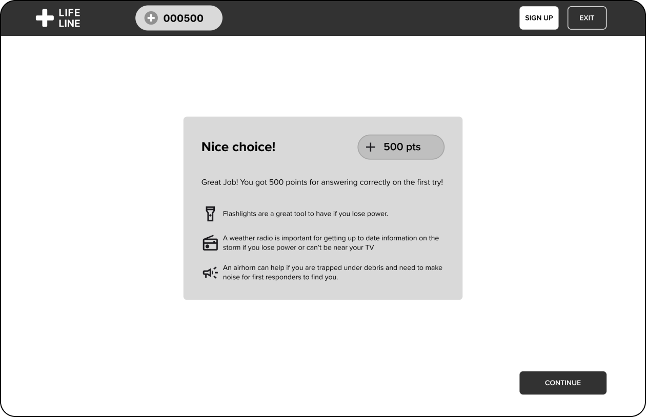
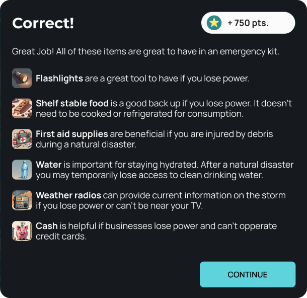
EMERGENCY KIT CHOICE
EMERGENCY KIT CHOICE
GAME INTRO
QUESTION 1 INTRO
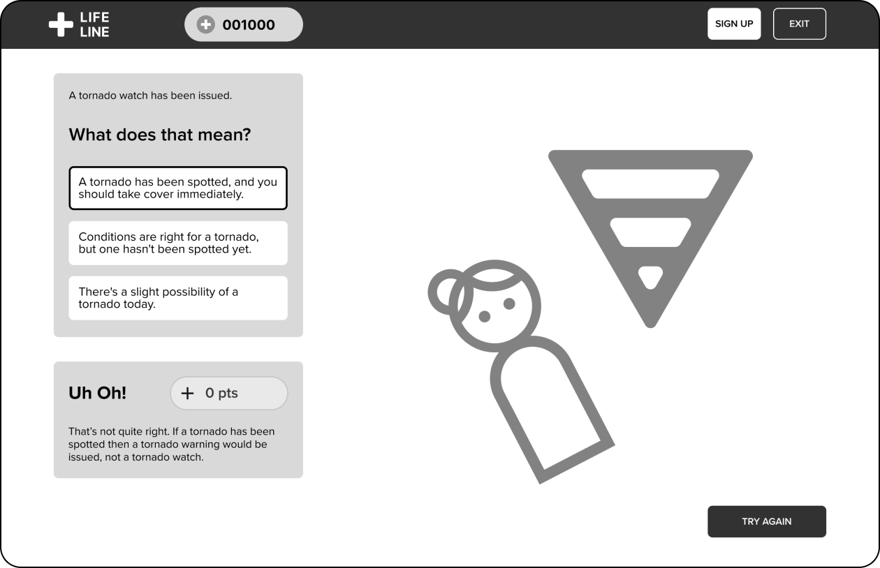
QUESTION 1
CORRECT ANSWER
WRONG ANSWER 1
WRONG ANSWER 2
QUESTION 2 ANSWER
QUESTION 3 ANSWER
QUESTION 4 INTRO
QUESTION 4
QUESTION 4 ANSWER
QUESTION 5 ANSWER
QUESTION 6 ANSWER
QUESTION 7 ANSWER
GAME END
SAVE PROGRESS
ACCOUNT CREATION MODAL
SIGN-IN MODAL
GOOGLE ACCOUNT CREATION
KIT MODAL
LEADERBOARD MODAL
USABILITY TESTING
What do users think?
While our developers began building the product, I handed my hi-fi prototype over to a few potential users to test out the product and evalute the effectiveness of the learning experience.
Goals & Success Metrics

TEST RESULTS
How did the prototype perform?
I had users living in tornado prone areas try out the prototype and evaluate what they learned.

PRIORITY REVISIONS
Iterations For Future Sprints
Fortunately, after testing there weren’t many glaring iterations to make, but after evaluating the results and suggestions I narrowed down the 4 most impactful changes our team could make after launch.
Answer Modal
During Testing
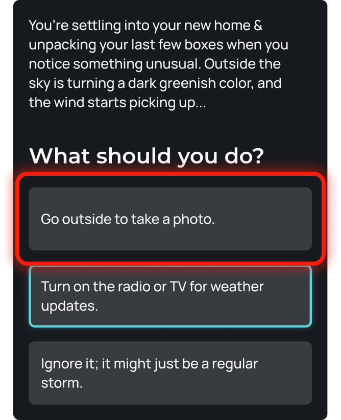
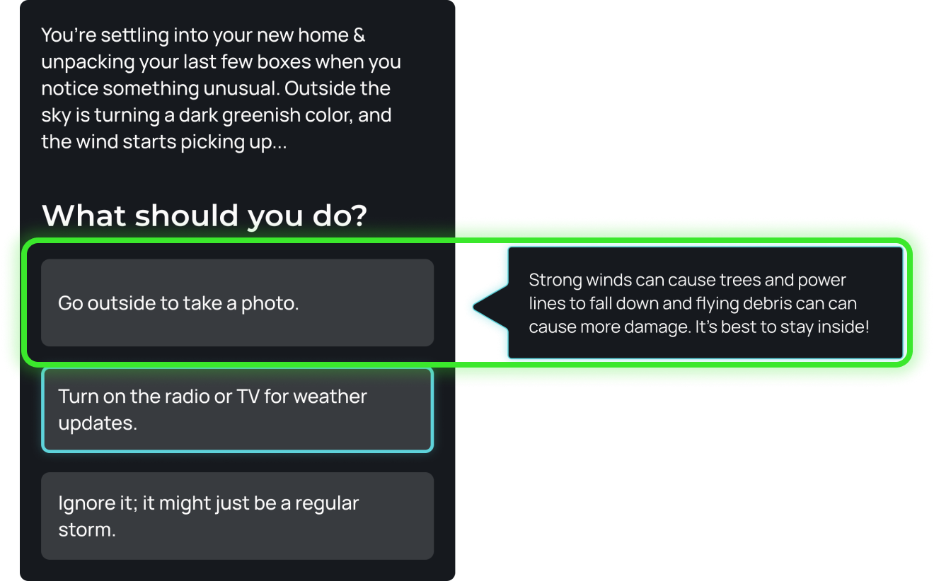
Two users mentioned they wanted to know why the other choices were wrong after they selected the right answer.
After Testing
I added a hover feature when users hover over the other answer choices a message appears explaining why its wrong.
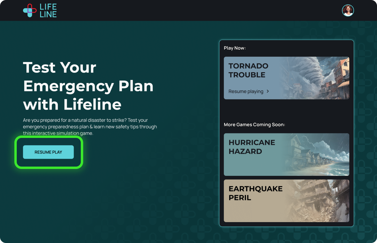
Homepage Signed In
During Testing
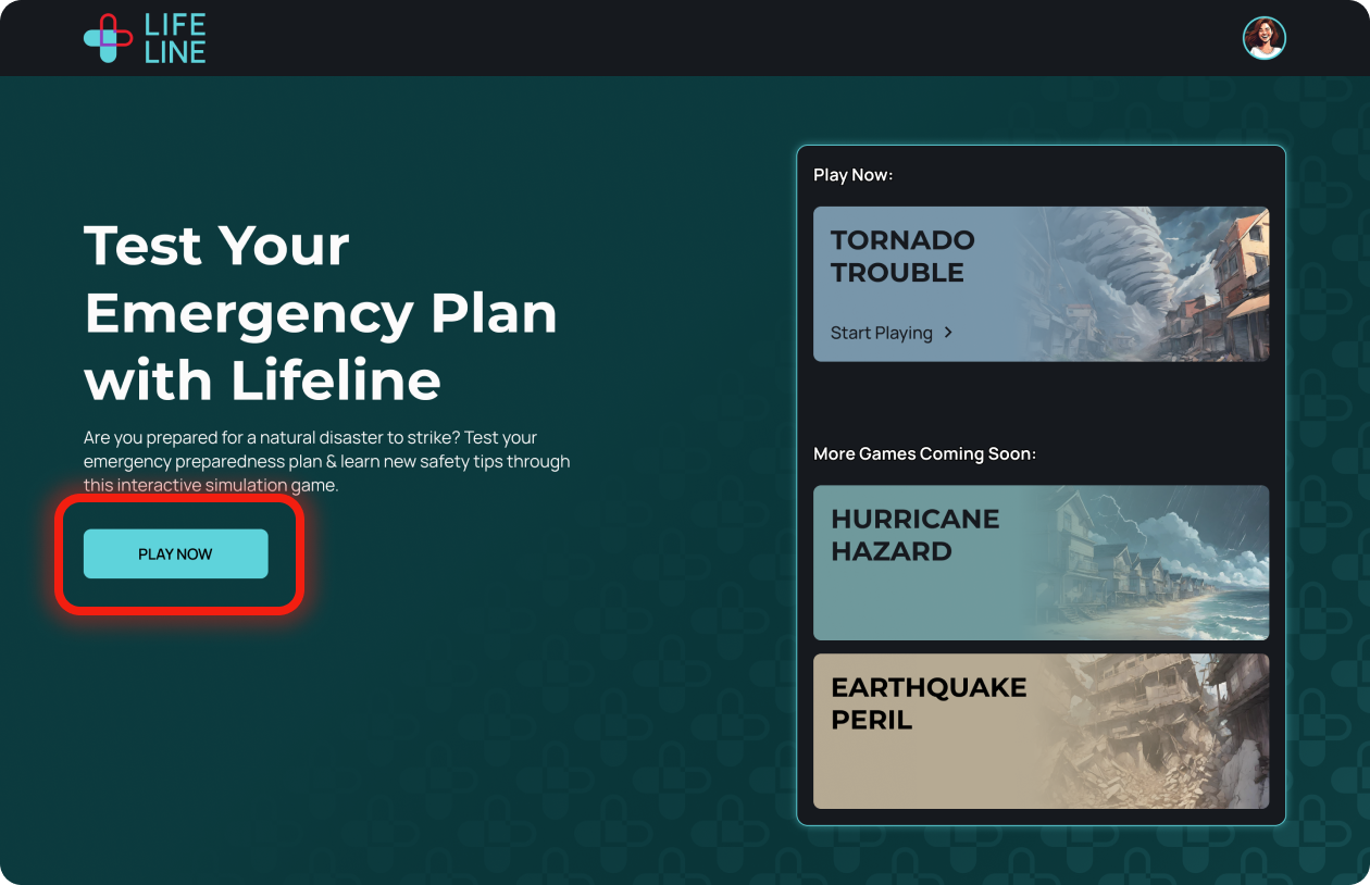
Two users clicked the account icon before the ‘play now’ button. The copy on the button was not clear.
After Testing
I updated the copy on the button to say ‘resume play’ making it more clear the game will pick up where the user left off.
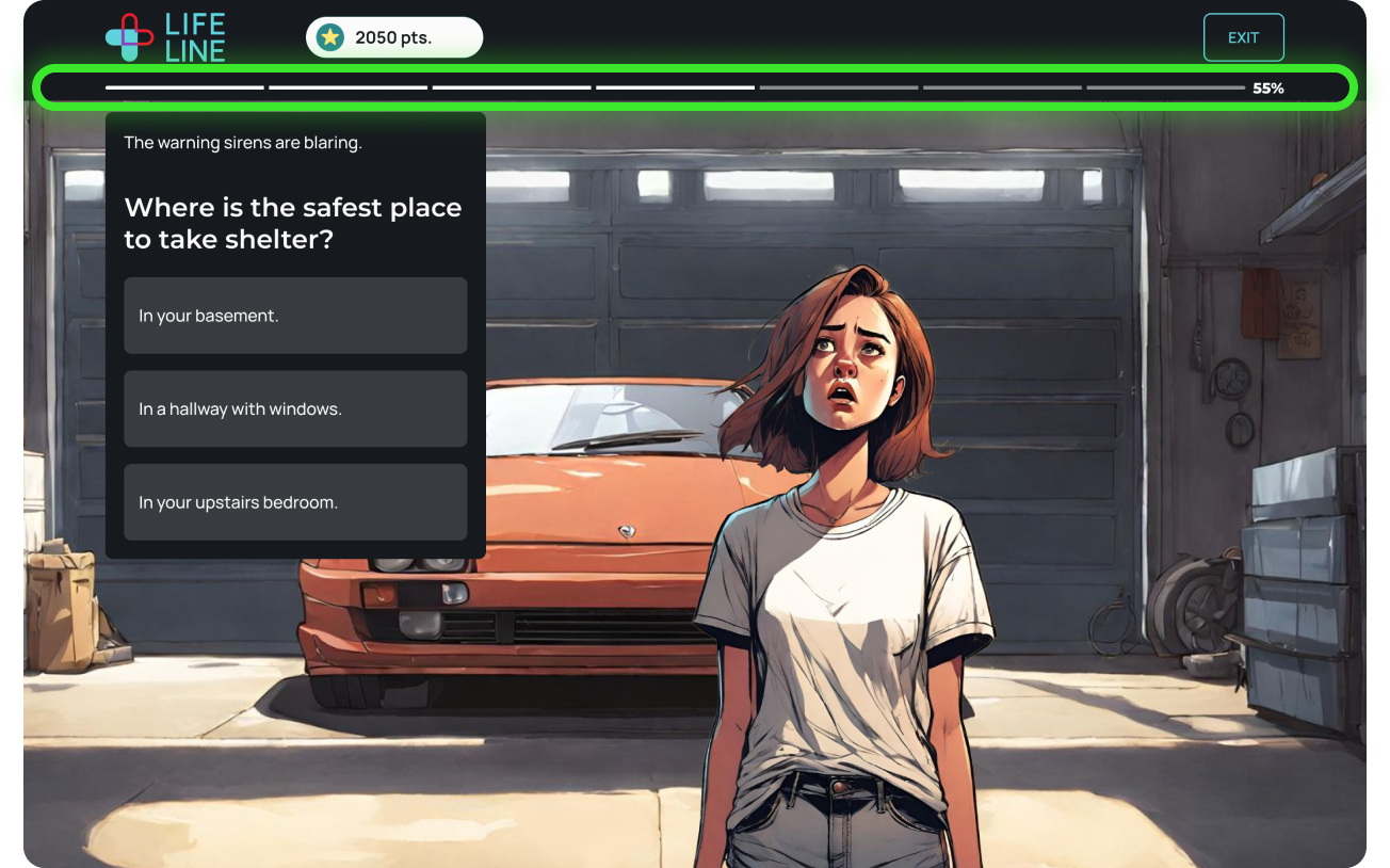
Progress Indication
During Testing
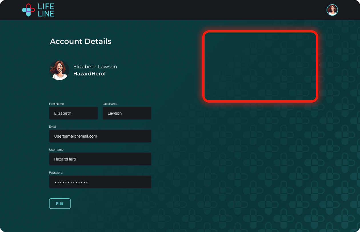
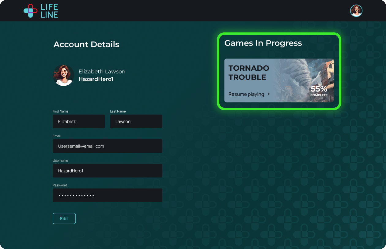
Two users indicated they would like to view their progress through the game so far - one would like to see it in gameplay and the other, on their account details.
After Testing
I created 2 solutions where users can view progress. Discussing technical possibilites with my team and recieving feedback on both solutions from users could help indicate if both or just one solution is necessary.
I added a progress bar in the banner at the top of the screen so users can understand how far they’ve advanced in the story.
Solution A
Before
After
I added a ‘games in progress’ section within the account detail page for users to pick up where they left off. There’s room for additional games as the product grows.
Solution B
Before
After
UX & UI REVIEWS WITH DEVELOPERS
Fine Tuning the Details
Working with our developers on the final output was crucial for successful usability implementation. My biggest takeaway from this experience was learning how to communicate execution of responsive design details.
FIGMA ANNOTATIONS
I took screenshots of what the developers built and annotated them in Figma to show what changes need to be made for best usability.


