Local Artist
A responsive website to expand an artist’s online presence and revenue stream.
Role
UX/UI Design
Prototyping
User Testing
Tools
Figma
Figjam
Google Meets
THE PROBLEM
Limited Online Presence
Jayne Kennedy is a Cincinnati-based artist specializing in vibrant landscape paintings and whimsical character art. She’s created several large scale landscape paintings and portraits by commission and is looking to build a stronger brand presence online.
THE CHALLENGE
How might we showcase Jayne’s skill set and commission process to increase confidence in customers & grow revenue?
THE SOLUTION
Online Gallery & Shop
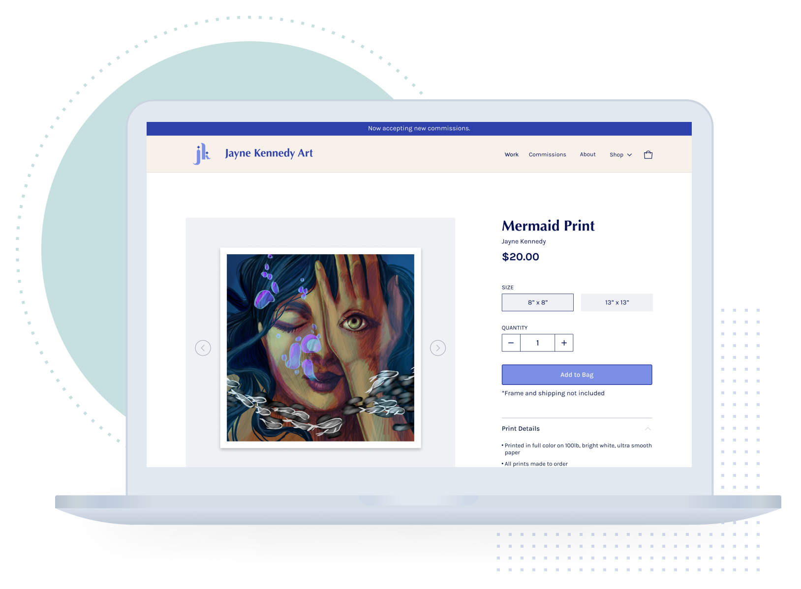
A large online gallery with art prints available for purchase and an outline of her artistic process increases access for customers to purchase her artwork. Providing more context around her work will give future clients more confidence working with her.

CLIENT INTAKE INTERVIEW
What are my client’s goals for this website?
To kick-off this project, I interviewed my client to better understand where she felt her website was lacking & what she wanted my help with.
USER RESEARCH
Understanding discovering new artists & commissioning artwork.
5 Art Enthusiasts • Ages 25-55
Learn how they discover new artists.
Discover why they purchase artwork.
Determine what factors influence their purchase.
Learn what other platforms they’ve used to purchase art.
Understand the process they’ve experienced to commission art.
Interview Goals:

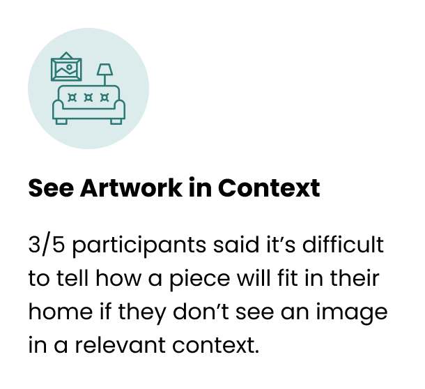
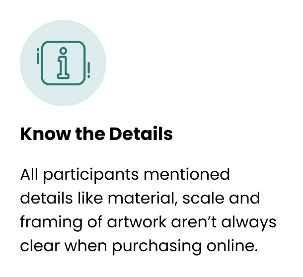
What do customers need?
USER PERSONA
The Fine Art Enthusiast
I generated the target customer based on feedback and insights gathered from interview participants.
SITEMAP
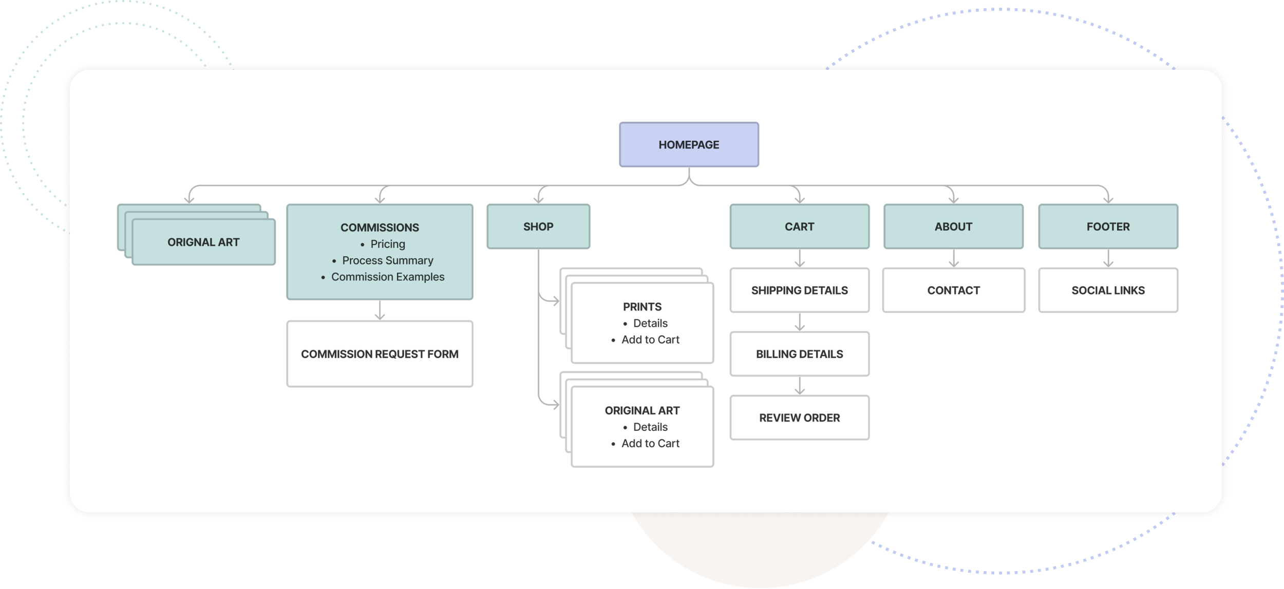
Creating a Simple Structure
After analyzing the needs from both my client and her customers, I created an outline for the website that prioritizes communicating key information to users about what they’re purchasing.
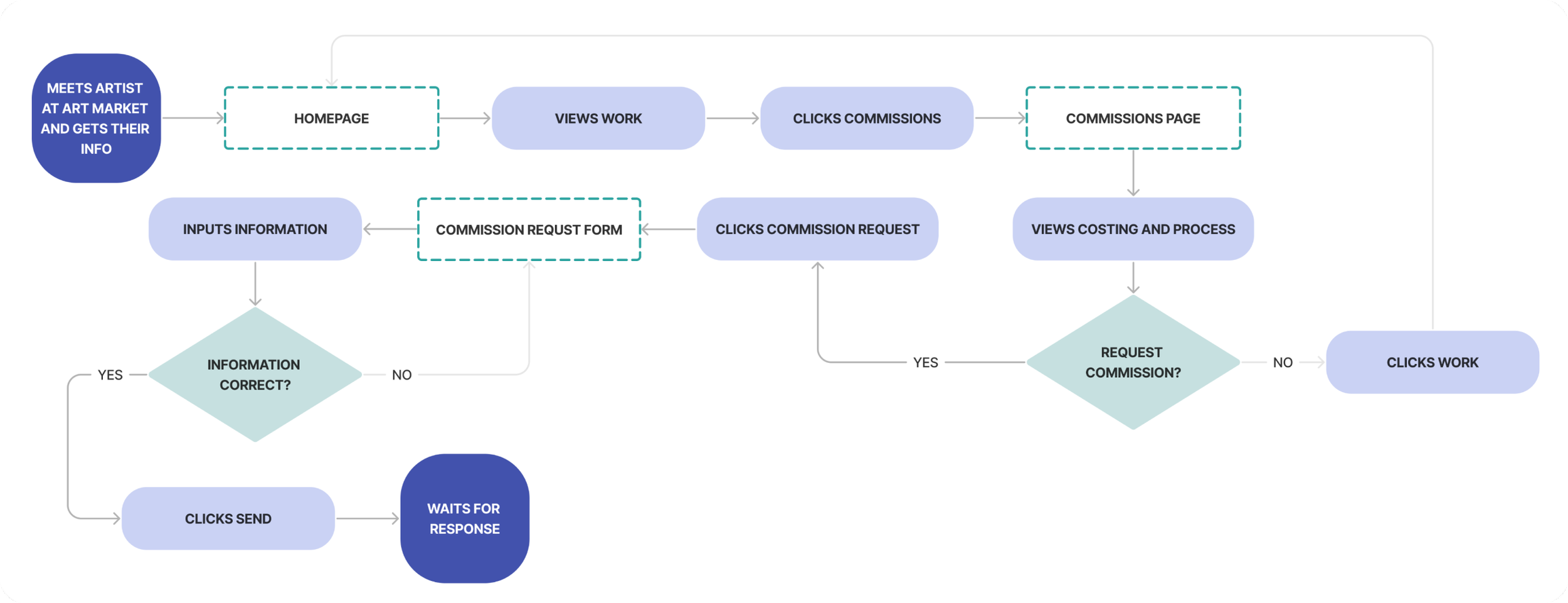
USER FLOWS
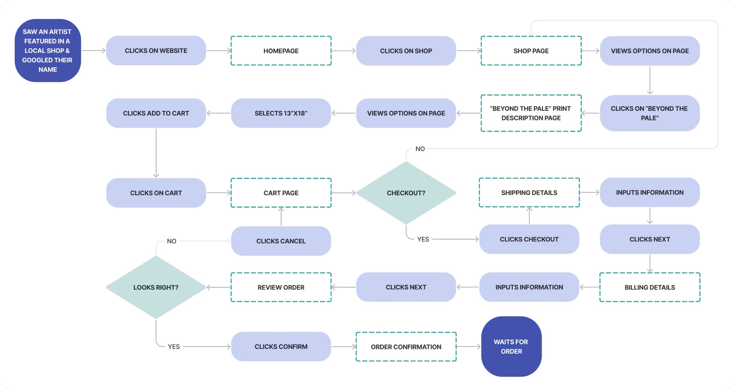
Understanding Key User Interactions
As an Art Enthusiast, I want to view and purchase an artists’ print on their website, so I can support their craft.
As an Art Enthusiast, I want to understand how I can commission a custom piece of art, so I can order a commission with confidence and capture one of my favorite memories in a special way.

LO-FI WIREFRAMES
Putting Pen to Paper
I sketched several layouts for each screen and brought them back to my client to get an idea of what she was gravitating toward and work out any questions that came up on my end.
MID-FI WIREFRAMES
Connecting Client Asks and User Needs
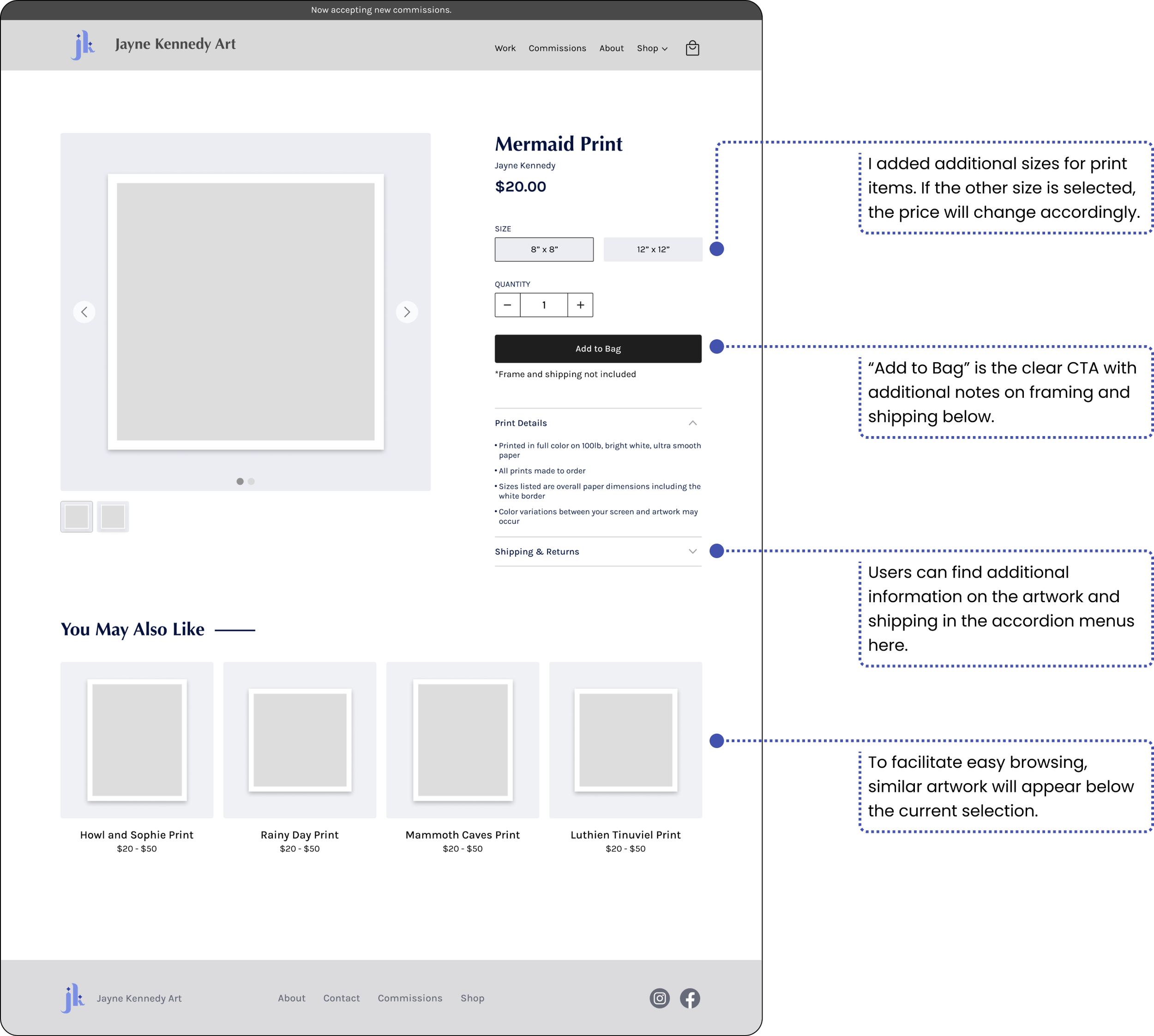
While designing the page layouts I prioritized communicating key information that encourages customers to feel confident purchasing prints or custom artwork from Jayne.
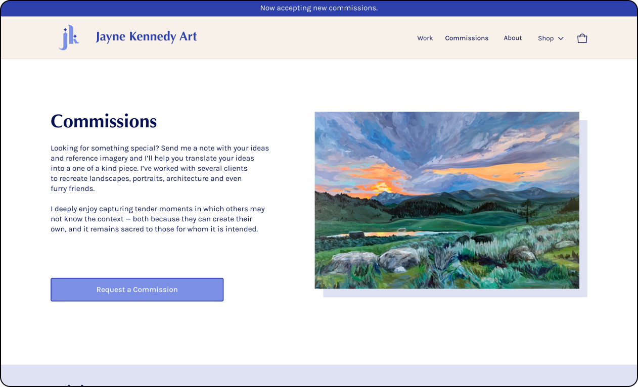
COMMISSIONS SCREEN
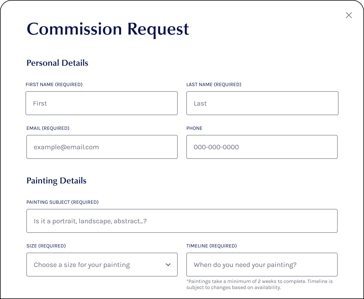
COMMISSION REQUEST FORM
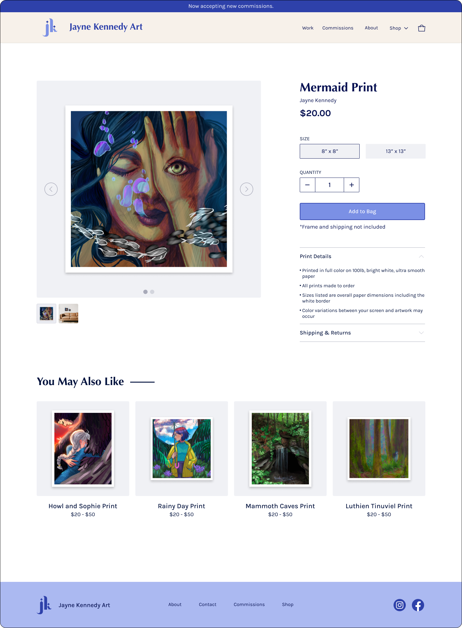
PRINT DETAIL SCREEN
BRANDING
Jayne Kennedy Art: clean & minimal with a touch of whimsy
As part of my scope of work, Jayne wanted a stronger brand identity throughout the website. I created this moodboard based on brand words she shared with me: friendly, relatable and whimsical.
BRAND ELEMENTS & UI KIT
Jayne had a hand drawn logo that I simplified through vectorization. Overall I kept the branding minimal to not compete with her artwork on the page.

HI-FI WIREFRAMES
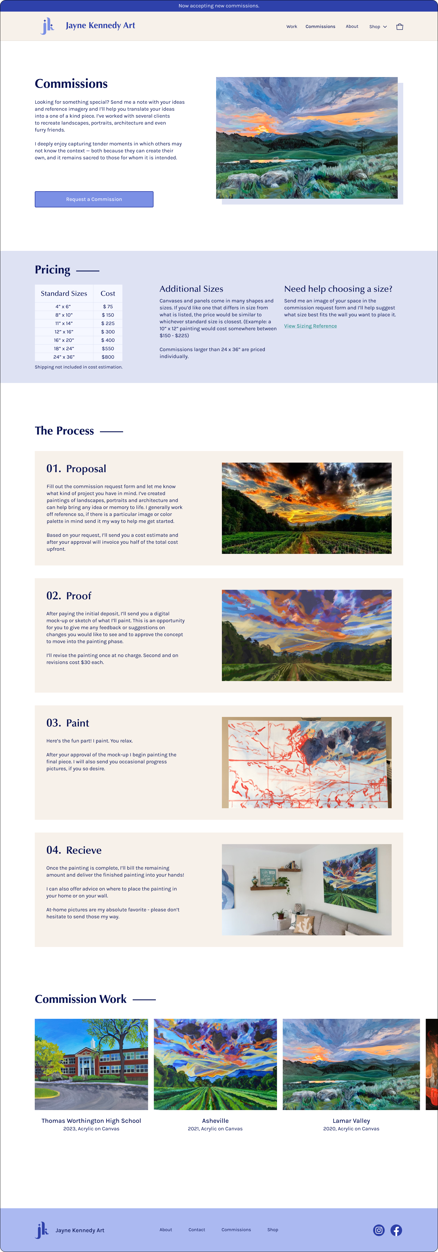
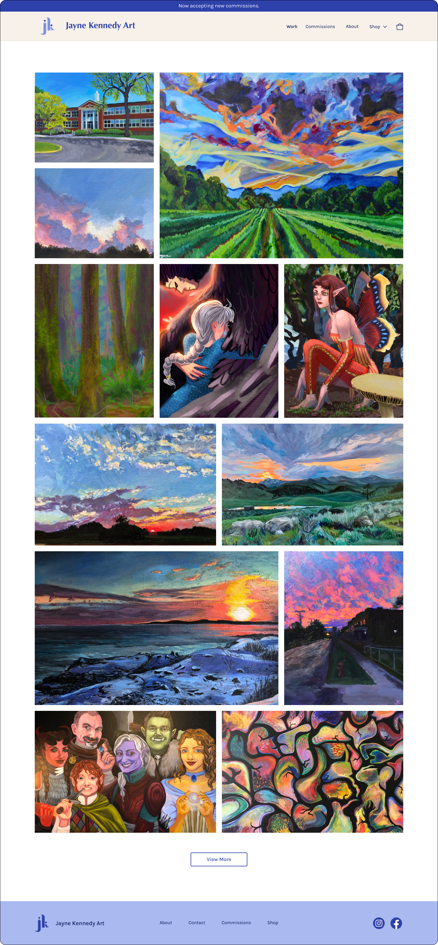
A Responsive Website for a Warm, Elegant and Whimsical Artist
COMMISSION SCREEN
HOMEPAGE / GALLERY SCREEN
SHOP PRINTS SCREEN
ABOUT SCREEN
PRINT DETAIL SCREEN
USABILITY TESTING
Time For Some Feedback
I finished my prototype and placed it into the hands of 5 potential users for valuable feedback on improvements.
Goals & Success Metrics

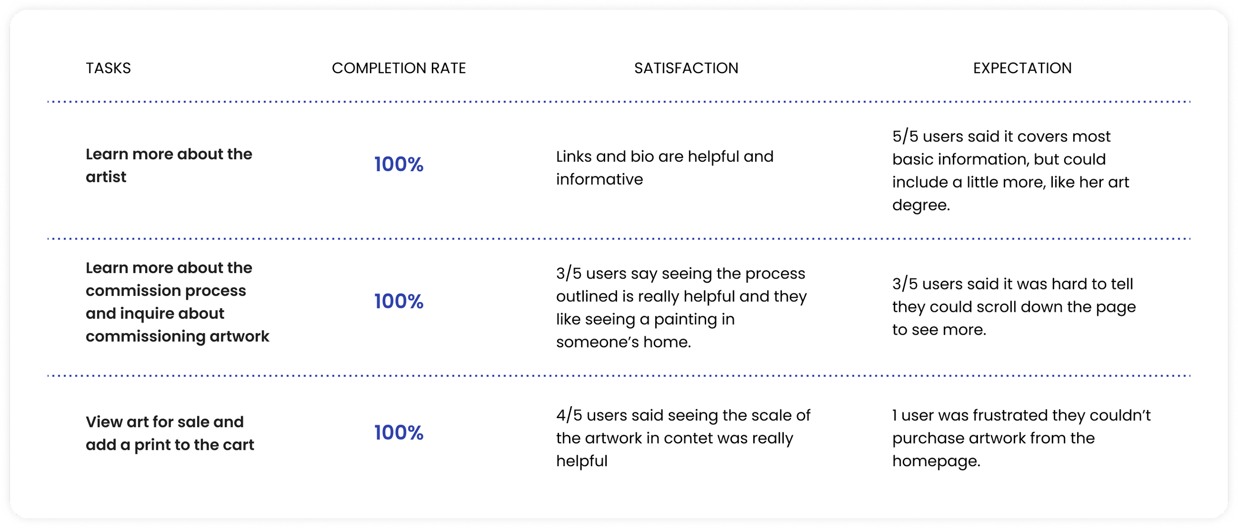
TEST RESULTS
How did the prototype perform?
After polishing the prototype with the branding and imagery, I handed the product over to users to evaluate the effectiveness of my proposed solutions.

PRIORITY REVISIONS
Back to the Drawing Board
After analyzing the user test results, I reviewed them with my client and implemented the 3 most impactful changes.
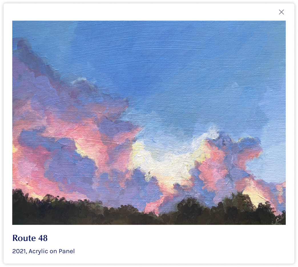
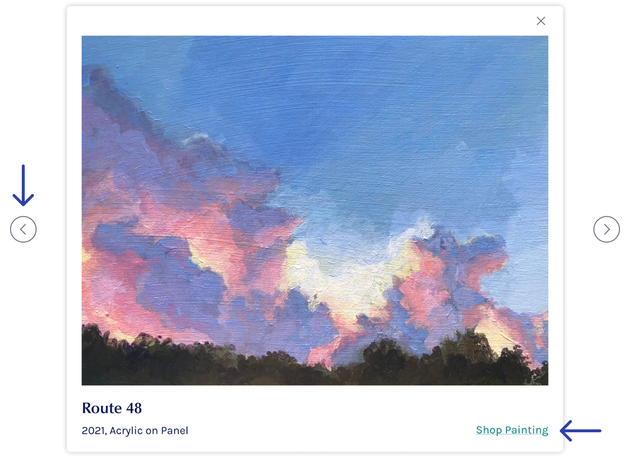
Homepage Artwork Detail Modal
Test Results
One user wanted to purchase artwork directly from the homepage.
Another user wanted to more easily view the next image of artwork.
After Testing
I added a link to artwork that’s available for purchase within the modal window.
Chevrons were added to the left and right of the modal to indicate users can view the next image.
Commission Screen
Test Results
60% of participants communicated it wasn’t clear they could continue to scroll down the page.
After Testing
I reduced spacing between all the sections on the page so the header peaks up over the bottom of the screen.
Commission Request Form
Test Results
One participant wants to give a preferred method of contact and another said they wanted to specify which painting medium they want the artwork in.
After Testing
Radio buttons were added for users to select a contact method. I also added a dropdown for users to select the medium. The artist informed me the medium will affect which size options appear in the size dropdown.


